Tell us how you Customize BricsCAD!

We're currently looking to improve the layout of the BricsCAD workspace. We'd love to see how people customize and why. We're asking you to upload an image of your workspace and tell us anything you'd change about it. (see example)!
TL;DR - upload an image of your BricsCAD workspace.
Comments
-
1) I keep the top bar visible only for "hide component", "isolate" and "show all", which I am using like 20 times per minute. I know I can use QUAD for this, but it is much slower.
2) I switch mostly between "Solid", "Assembly" and "Annotate" Tabs (90% of the time), and sporadically use the others.
3) I used intensively the left dialog (component tree) to select components, to show/hide them and to navigate the model.
4) Console: As many buttons act inconsistently when called from console or from click, I am used to one or the other (the one that best fit my workflow). For instance, I will use console for "UCS" or "Array", but I will use buttons/shortkeys for "extrude" or drawing lines.
5) I use the tool bar (and shortkeys) intensively to enable/disable DUCS, ESNAP.
6) The view is always in this "modeling" rendering, which help me to see complex models. Mostly in Ortho, but sometimes in perspective too.
7) I work always in Metric (because that's the international standard right?). But usually in "mm" instead of plain meters, just to avoid using the dot all the time.
8) My screen is 4K 40". For the screen-shot, however, I reduced the window to not generate a huge image.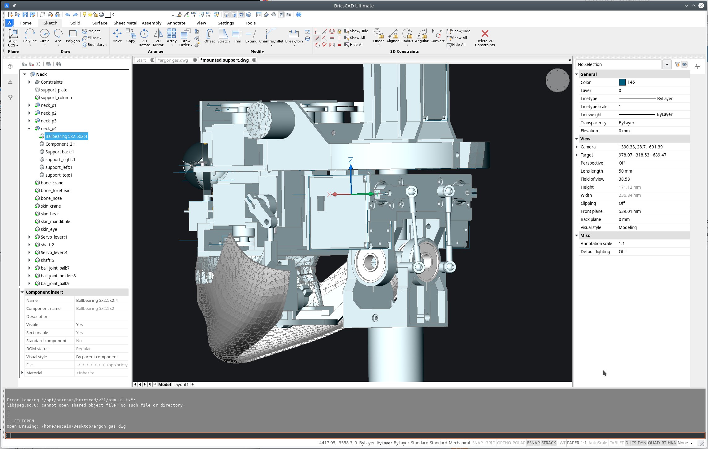 0
0 -
I use two layout schemes, and F5 toggles between them. Also, MM toggles between modelspace and paperspace, and BB toggles background color between black and white, in either space.
But most of my customization is:
Custom versions of all the commands I use commonly, so that I never have to type an option letter after issuing a command, and I never have to type a P or L for previous or last. Commands that create new entities leave all the new entities selected, and all other commands leave the previous selection set still selected.
Command aliases, with single-letter aliases for all the editing commands I use commonly, double-letter aliases for all the drawing commands I use commonly, and triple-letter aliases for the commands I use less often.
Three custom pull-down menus that have everything I don't use commonly but want to keep handy:
.... less commonly-used custom commands;
.... variables; and
.... viewport scale assignments.
0 -
That's great you're asking for input.
"We'd love to see how people customize and why."How: I'm using several external libraries and the BRX SDK to do some customization for electrical engineering power system work. Basically analysis based on this book, POWER SYSTEM ANALYSIS AND DESIGN by Glover and Sarma. Also, I'm adding custom toolbars for the commands.
Why: I needed a graphical front end for my software and, when complete, I would like to put it on the app store for sale. It will compete with SKM, ETAP, POWER WORLD, etc...
BETA testing is ongoing. Things seem to be working well so far.
0 -
here is mine.
Most Top Bar Panels :
- Access 3D
- View
- 2D Entity Snaps
- 3D Entity Snaps
Because I was always used from other 3D and CAD Apps,
to always have any kind of View Navigation, Snapping, (Layer), Selection switches, ....
accessible by a single click.Ribbon
Great !
Left side Structure Panel
A must.
Right side Properties Panel
A must.
- 75% Properties
- 10% Layer
- 10% Compositions/Profiles
Bottom "Command Line"
I don't want it, but you can't realistically use Bricscad with extended CL
BTW1
You can see what immense GUI space wasters Command Line and Ribbon are
on larger Monitors. And as long as you can't use that empty, non-used Panel
space for other things.BTW2
On Mac the bottom docking area with Command Line goes over the whole
screen width, which makes CL even wasting more space.BTW3
On M1 Mac you can see that my important File Tabs on top of View Window
are gone !
I tried everything with Settings, beside trashing Config/CUI, but don't get my
File Tabs back.BTW4
Meanwhile Bricscad Dark Mode got really good !
(great Icons now)0 -
I spent a lot of effort to create my own All-in-1ribbon panel. I made a ribbon in which all the commands I need are available in 1 click, without switching ribbons. I added there commands that I forgot in BrickSys - for example, UCS control commands or commands for switching visual styles. In addition, I added all the commands from my self-made A>V>C> plugins there.
There is one big problem left - BricsCAD does not remember the ribbon and every time you load it you have to switch it. And I never managed to make my ribbon the first on the list.
If you want, you can take my ribbon as a basis. Download AVC_Br.cui and AVC_Br.resz here https://www.dropbox.com/sh/sfjvztwsepjm3q0/AADJshktuDISZUko-tBu3nLma?dl=00 -
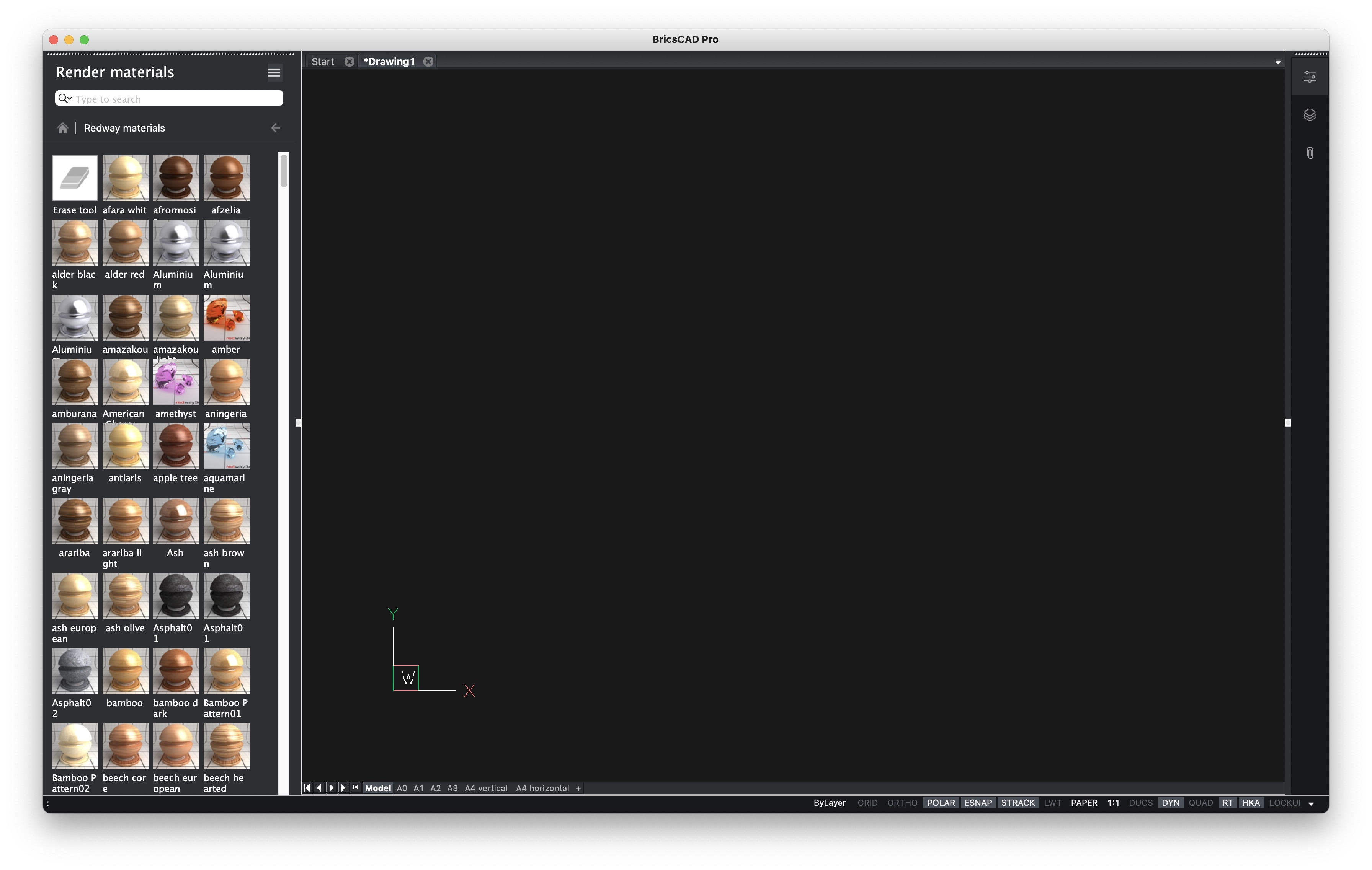
I use the command line pretty much exclusively, so not much going on. But I'd love the render materials panel to pop out of the right side panel like many of the other panels, instead of creating a new panel on the left.
 0
0 -
About the command line: in V20 the 'mini-frame' command line feature was introduced.
When the command line is floating, set the value of the CMDLINEUSENEWFRAME (command line use new floating frame) system variable = 1 to minimize the command line to a single line. When you move this mini-frame to the bottom edge of the graphic screen, it sticks there.
When executing a command a number of prompt lines display temporarily and transparently in the graphic screen. The number of prompt lines is set by the CLIPROMPTLINES system variable.0 -
@CBE, you should be able to drag the Materials toolbar over to the Panels and it will add it there to be used just like the other existing items.
I see you are using the Mac version, but you can in Windows 10 anyway.
0 -
For me the Render Materials opened on the right Panel
automatically on Mac since a few versions.But I prefer it in the left Panel like in CBE's screenshot.
(As I do not need Structure Panel while dealing with Materials,
but my Properties Panel on the right instead)So I sometimes moved it to the left manually again
 0
0 -
@Louis Verdonck said:
About the command line: in V20 the 'mini-frame' command line feature was introduced.
When the command line is floating, set the value of the CMDLINEUSENEWFRAME (command line use new floating frame) system variable = 1 to minimize the command line to a single line. When you move this mini-frame to the bottom edge of the graphic screen, it sticks there.
When executing a command a number of prompt lines display temporarily and transparently in the graphic screen. The number of prompt lines is set by the CLIPROMPTLINES system variable.I basically would prefer the Head Up Display Style.
But first it dims out before I finally understood what the CL wants to tell me
and second,
I need at least 5 persistent CL lines + sometimes even scroll option,
to be able to recognize if BLOCKIFY or DMSIMPLIFY did some work or not,
before CL spit all following "Access Violation", "Geometric Error", .....
warnings0 -
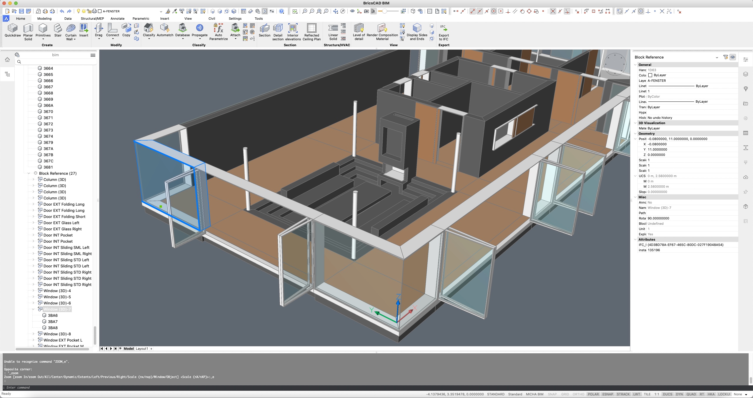
Interesting to see folks' similarities and differences. I use BIM workspace 80% of the time, with the remainder Drafting (toolbars, sans ribbon), or occasionally Mechanical, although I increasingly forget to switch since I've added most of those functions to my primary BIM workspace and gotten a larger display on which the ribbon is less intrusive.
Like @Michael Mayer, I rely on Structure Browser on left and Properties on right, almost always wanting those visible if I have any panels open. Just as important for me is the Layers panel—I'd love a way to instantly expand and collapse that one horizontally, as requested in prior discussion. I've tried to dock it below the other left panels, but that prevents collapsing the whole stack of panels which I do fairly often.
I end up switching among panels frequently, so a similar way to cycle thru them as ctrl-scroll does for ribbon tabs would be handy.
Flexibilty for sub-stacks or sections of panels, to re-arrange and hide independently would be good. I usually like having the full height for the Properties list, especially with BIM, when I'm working generally with keyboard, quad, or ribbon commands. But then when I go to apply Compositions or Profiles, say, I find myself still wanting to see some Properties (such as which composition a selected object might already have been assigned, which does not show in rollover tips). In that instance, however, rather than getting fully hidden, it would be sufficient if the Properties list were reduced to a fraction of its full height and stacked above Compositions, Profiles, or whatever other panel I'm actively using for the moment. A related wish—please make it possible to filter and sort the Properties sections, to avoid having to always scroll to the bottom to enter component parameters, for example.
On the left, I find a similar desire for Structure Browser, i.e, that I want it either full height or else reduced yet still visible while using an adjacent panel.
Crazy idea—could it be possible to have more than one Structure Browser panel open simultaneously, displaying different filtering/grouping configurations for the same model??
By the way, can Sheet Sets panel be restrained from upstaging the other panels? I haven't pinned down which operations trigger that habit, but notice it with BIM projects (even with SSMAUTOOPEN off).
Back to the main topic, I keep toolbars limited to one row. Access3D, Layers, 2D & 3D snaps (mostly for visual reference of which snaps are active), plus just a few toolbar customizations:
1. A clipdisplay toggle, which I use constantly, until it's possible to do so from Structure browser. [Even then, I've been meaning to figure out how to lisp a command to toggle clipdisplay for whichever section was most recently activated....]
2. Button for AI_MOLC, to make the already-selected object's layer current [that I should also make a lisp shortcut for].
3. Controls to activate saved views and visual styles.After thinking I couldn't work with fewer than 4 command lines, I've come to like the minimal floating version, and just use F2 to expand it temporarily when needed.
Apart from shuffling and adding a bunch of tools to some ribbon panels (mostly commands that are newer and I've not given or learned an alias for, or that are hard to find in the quad), that's about it.
0 -
^ 100% agree with all above.
0 -
@CBE said:
I use the command line pretty much exclusively, so not much going on.By far the coolest Bricscad CUI Setup.
0 -
Just as important for me is the Layers panel—I'd love a way to instantly expand and collapse that one horizontally, as requested in prior discussion. I've tried to dock it below the other left panels, but that prevents collapsing the whole stack of panels which I do fairly often.
I also would like to have Properties and Layers beside each other,
docked to the right side to have full height.
But that would leave a quadratic drawing window only and I don't
have that much screen estate.In the past I always docked Properties and Layers in a single Column
over each other. But somehow the height of both was not enough
in Bricscad and also it did not keep my aspect ratio reliable,
Properties 60% to Layer 40%.
(But I am on Mac(/Linux) so GUI Customization is a more risky and less
reliable in general)
Somehow the same vertical PPT/LAY layout still works fine in Vectorworks
for me. Somehow Bricscad GUI can hold less content on the same space,
although the Font (and Icons) are often pretty small (or Icons huge)So meanwhile I got used to switching through my right Panel column
all the time.0 -
These are all really great! Keep them coming.
0 -
I make Bricscad much like Autocad 10, right down to the toolbar button images.
I'm not opposed to having more UI options, but please keep the existing options for those of us who are well served by "old school". What I do now, which uses lisp functions behind most of the toolbars, works well and is very efficient for building electrical design. "If it ain't broken don't fix it" applies.
Retraining to use alternate UI components costs me time and money. I'm not opposed to better UI systems, but if they cost more to implement than the amount they improve profit for my company it would be foolish to change. As an example the ribbon is simply different from toolbars, not better. For me a ribbon is distracting because it is constantly changing and I find it hard to develop muscle memory. A ribbon also requires sub-menus for many functions, which means more clicks to run the same function. Similar to Microsoft BOB... With the lisp functions I use the toolbars are at least twice as fast as trying to use a ribbon. FWIW I don't run any programs that are ribbon only because the UI does not work well for me. I'd also love to go back to toolbar buttons with borders. How a UI looks is far less important to me than how a UI performs. Visual Clues like toolbar button borders make the buttons easier to use than trying to guess the target area of an amorphose blob. The 17- to 24- year-olds that have worked for me (one of whom called me "older than dirt" regularly 20 years ago) agreed with the above.
Please be sure keep the traditional UI methods available and please don't make the next "best thing since sliced bread" approach a default I have to spend time unwinding to get back to what I prefer when I upgrade. I have no objection to a one time alert that asks if I'd like to try a new UI element, but there needs to be an easy to use "take me back to what I had before" method if I determine that new /= better for what I do. As it is I have to spend several hours resetting my system with every major update because only about half of my settings are automatically carried forward.
Thanks for the opportunity to have input.
0 -
I haven't altered my GUI too much from the OTB setup, but I do have some suggestions to make my life visually easier.
Bring back the Ribbon Entity Snaps Panel, which disappeared after V19 (unless I have missed something) It is too much of a pain to completely rebuild this Ribbon Panel. Why did it disappear completely rather than not be visible with the default setup?
When using the Layers dialog as a Palette, it doesn't come out far enough to be useful. If you increase its size it alters all of the other Palettes which then come out come far too far.
The Tool Palette used to have the ability to have the Tabs running vertically up the side of the Palette when it comes out.
Now they are all squashed down the bottom with scroll arrows, please bring this back.When using BMINSERT adjusting the constraints is very awkward.
If you use the Properties Palette, they are all down the bottom and you need to scroll to see them all.
You can't use the Parameters Palette (even though it has the most real estate available to it) as the constraints all show there but are uneditable.
The Mechanical Browser also has space limitations as the only constraints you can alter are all at the bottom.Speaking of Parameters, it would be really useful, if when selecting a dimensional constraint on the drawing it highlighted in the list and vice versa.
It would also be nice to be able to sort the Parameters so the ones you alter the most were at the top or better still hide the ones you don't alter.The drawing Tabs for each drawing are indistinguishable from each other apart from the one you are working on, and the + sign at the end of the list is too close to the x on the drawing tab, so you sometimes start a new drawing raher than close one.
I find it amusing that in the Shaded Viewport Options of the Page Setup, the word "Quality" (and DPI) is the only word that is almost unreadable as the Quality is so blurred :-)
Sorry if I went a bit off topic, they are all visual observations :-)
0 -
^ good suggestions
0 -
@ScottS
"3. Controls to activate saved views and visual styles."
Such controls are available! Just add them to an existing toolbar, or create a new one.
See https://help.bricsys.com/hc/en-us/articles/360006433954-Creating-custom-tools#to-add-a-control-to-a-toolbar
Visual styles are also available in the right click menu of the LookFrom control.0 -
using bricscad for 2D drafting and 3D BIM. Monitor LED-LCD IPS 27"
on top the default toolbar, i think it was not there standard so I added left of the layers dropdown the button to acces the drawing explorer layers popup (showing the layers in a panel on the right side of the screen is too narrow too see the desired options)
2D drafting and dimension toolbars
Pretty default - yet - , however I made some custom toolbars
visual styles
1. for quick switching between visual styles (however drawing explorer (CTRL-2) >> visual styles is used often, but the buttons are quicker)One special for BIM profiles (steelstructures)
1. contaning customized buttons BIMOSMODE (snapping options profile)
2. display axis of profilesmore info about BIMOSMODE see bottom of page
https://help.bricsys.com/hc/en-us/articles/360007655494-BIM-Linear-Solid0 -
2D drafting and dimension toolbars
I think your left row's 2D Drafting Tools
(Line, Polyline, Circle, Arc and especially Rectangle !)
Should be just part of the left side of the Ribbon's Home + Modeling Tabs.
Just like the 3D Primitives do.
Or how they are present in Bricscad ShapeAs access to Rectangles is pretty essential in Direct Modelling.
Like for Boundary Detection, creating Openings or Windows in Walls, ....Currently I always search the Rectangle from :
make sure nothing selected / Quad / Draw0 -
Re ribbon menu's Autocad in its wisdom dropped mnu for Ribbons so must use the CUI, Toolbar and pop use mnu so simple to make custom menu's.
It is on my to do list, the Ribbon cuix refer Autocad here, it is a compressed XML file re ZIP, there is a CUIX to mnu lisp out there and can then inspect what is inside. The idea would be to write the correct xml code by reading a txt file etc.
Like others I know this is Bricscad but I use CIV3D also rather than jumping between workspaces drafting and CIVIL just copied all the CIV3D commands that I use often and made a custom POP menu. As talking CIV3D it forces multiple steps to change items like surface display so wrote a Toolbar that resets the surface styles want 0.5 contours click toolbar icon. A very needed function that is missing.
0


