Layer Palette - Use old style?
In version V22 the layout for the floating layer palette was redesigned for the worse. Is there a way to default to the "classic" palette?
My issue is that, to me, the layout is less efficient. You have these large search boxes accross the top taking up space that frankly I never use. The "classic" palette was much more space conscious. It matters when you are on a laptop and don't have screen real-estate.
Additionally, when you click on the color box for a layer, and type your usual color, say for example "71", the color box in the Select Color pop up window is not automatically selected as it used to be in v21. This causes you to have to move your cursor, select the box, then type the color number... this slows down the process.
The classic palette, while not perfect, was way quicker to manipulate and compact. I could be missing some new tricks though, I'd welcome somebody to teach me.
Comments
-
Overall I like the new one.
As it is more legible.But maybe it needs some tweaks. Maybe file a feature request.
the color box in the Select Color pop up window is not automatically selected as it used to be in v21.
Reminds me on BEDIT,
when I hover my mouse over a Block to make the QUAD with BEDIT appear,
it opens a Block List instead to redundantly ask me again If I really want to
BEDIT this special selected Block. (In case I changed my mind !?)
Instead of just directly going into BEDIT Mode.0 -
it opens a Block List instead to redundantly ask me again If I really want to
BEDIT this special selected Block. (In case I changed my mind !?)YES!!!! that has always bothered me too... I'm like, "YES, edit this block I just selected to edit. I'm sure... no wait... yes, I'm sure, but let me look through a list?!?!"
These little "process issues" would be great to iron out. It would save steps. I'm all for less clicking and shortcuts. When you edit some dimension tick marks and not only do you have to do each end independently, there is also no shortcut to them as in autocad where you can just type the first letter of the tick mark you desire and it gets selected. So something that I used to do with a click-type once, now I have to click, drop/scroll, click, then again click, drop/scroll, click. 4 clicks vs. 1click+1key. It doesn't seem like a lot, but when you are doing it multiple times a day, it gets old.
0 -
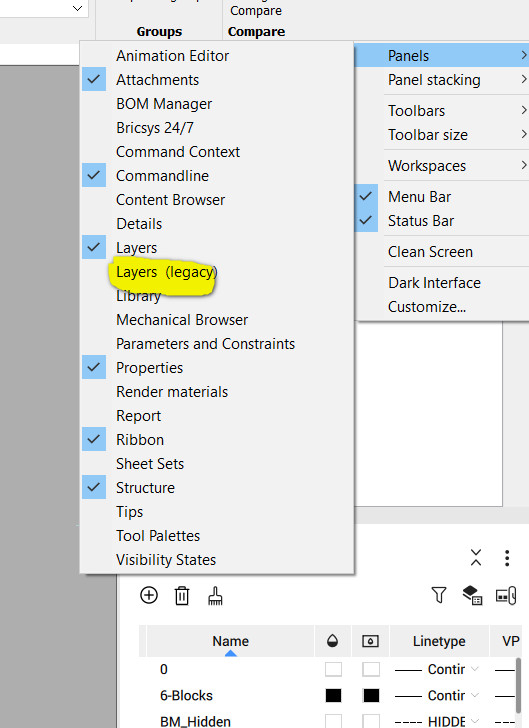
The classic / legacy palette is still there - right click on an empty space on the toolbar.
You ca minimize the search fields in the new layer palette.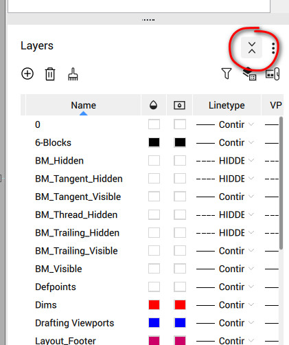
 0
0 -
Good to have the choice, and interesting to compare the two.
Even with the search fields collapsed, the new version looks less compact vertically than the legacy layers panel, although allowing the numbered first column "index" to be hidden helps reduce the width.I still wish for shift+mouse wheel to scroll horizontally (a la Notion)—in any panel, not just layers.
VP Freeze is missing from the new layers panel. Or did I overlook it?
0 -
Dear Scott,
the VPFreeze is still present, just make sure you are in the Paper Space.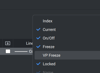 0
0 -
Thank you @codrut. The list of columns stayed open but wasn't changing when I switched to paper space from model space. You have to click away within the layers panel to hide the list first, and right click on one of the column headings to show the list again after paper space is active. Then all the VP layer columns are there!
0